Every Website in 2026 Looks the Same — and AI Is to Blame

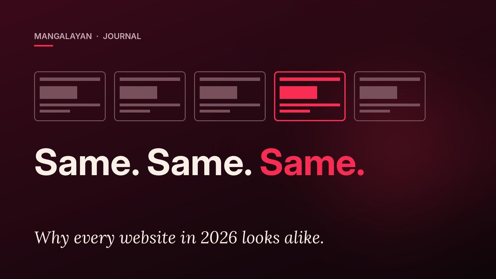
Open five new business websites in five tabs. Cover the logos. Can you tell which one sells software, which one sells saris and which one runs a hospital?
Most of the time, you can't. Same giant headline. Same soft gradient. Same three icon cards. Same "Trusted by" strip. Same rounded button that says "Get Started". In 2026, a huge share of the web feels like it came out of the same factory — because, more and more, it did.
The factory has a name now: AI. But blaming the tool alone would be lazy, and it would let a lot of people off the hook. So let's be precise about what's happening, why it's costing you customers, and how to tell if your own website has the problem.
The sameness started long before AI
Here's the part most "AI is ruining design" posts skip. The web was already converging before any chatbot wrote a line of code.
In a 2021 study presented at CHI, the world's leading human-computer interaction conference, researchers from Indiana University ran computer vision across a large set of website screenshots from 2003 to 2019. Their finding: website designs became significantly more similar after 2007, and for page layouts, the average visual distance between sites dropped by over 30% (read the study).
The causes they identified were very human: everyone using the same code libraries and frameworks, colour schemes becoming standardised, and layouts reshaped to work on phones. Add WordPress themes, template marketplaces and "best practice" checklists, and you get a web where everyone copies whoever copied the last person.
So no, AI didn't invent the sameness. What it did was put it on rocket fuel.
Why AI makes it dramatically worse
AI website builders and code assistants work by predicting the most likely answer. Ask one for "a modern website for a consulting firm" and it gives you the statistical average of every modern consulting website it has seen. That's not a bug. That's literally how it works.
The average is safe. The average looks "professional". And the average is exactly what your competitor got when they typed almost the same prompt last week.
Three things make this worse in 2026:
- Speed hides the problem. When a full homepage appears in 30 seconds, nobody stops to ask whether it says anything specific about the business.
- Everyone uses the same handful of tools. The same models, the same component libraries, the same default fonts and colours. Same inputs, same outputs.
- AI fills gaps with filler. No real photos? It suggests generic ones. No sharp positioning? It writes "We deliver innovative solutions tailored to your needs." That sentence fits every company on earth, which means it describes none of them.
If your website could belong to your competitor with a logo swap, it isn't working for you. It's working for the category.
Why a "same" website quietly loses you money
You might think: if it looks clean and modern, what's the harm? The harm is that a website's job isn't to look acceptable. Its job is to make a stranger trust you enough to call, book or buy.
Sameness hurts that job in three ways:
- You become forgettable. A visitor comparing three vendors remembers the one that felt different. If all three look identical, they default to the cheapest — and now you're competing on price.
- You look less trustworthy, not more. People have seen the generic AI look a thousand times. It can easily signal "made in a hurry", which is the opposite of what a serious business wants to say.
- Your story disappears. A family-run farmstay, a cooperative with decades of history and a new SaaS startup should not look like the same company. When the design ignores who you are, the visitor never finds out.
For Indian businesses, this matters even more. Much of what makes a brand here memorable — its region, its craft, its community, its languages — is exactly what a generic template flattens out first.
The 60-second sameness test for your website
Try this on your own site right now. Be honest. Give yourself one point for every "yes":
| Question | If yes, it means |
|---|---|
| Does your hero headline work for any company in your industry? | Your message is generic |
| Could you swap your logo with a competitor's and nobody would notice? | Your design is generic |
| Are most of your images stock photos or AI-generated people? | Your proof is generic |
| Do your service cards use the same icons you've seen on ten other sites? | Your layout is generic |
| Does your copy say "innovative", "tailored" or "solutions" more than once? | Your voice is generic |
| Is there nothing on the homepage that only your business could say? | Your story is missing |
0–1 points: You're in good shape. 2–3 points: You're blending in, and some visitors are leaving for a competitor who stands out. 4 or more: Your website is doing the bare minimum, and it's time for a rethink.
How to use AI without looking like everyone else
We're not anti-AI. Used well, it is a great tool for research, first drafts, code and testing ideas fast. The problem isn't using AI. It's letting AI make the decisions that should be yours.
Here's the rule we follow: AI can speed up the work, but people decide what the work says.
- Start with your story, not a prompt. Before any design, write down what is true about your business that isn't true about your competitors. That's your brief.
- Use real material. Real photos of your place, products, team and customers beat any generated image. Even a decent phone photo of the actual thing builds more trust.
- Design from your world. Colours, textures and typography should come from your brand, your region and your craft — not from a default theme.
- Write like a person. Read your homepage aloud. If it sounds like a brochure no one would say out loud, rewrite it in plain words.
- Treat AI output as a draft. Push back on the first answer. The first answer is the average. Your job is to be better than average.
You can see this approach in our own work. A boutique farmstay like The Grove Pushkar needs a site that feels like the place itself, while an ethnic wear label like Paschimi needs to feel like its craft. Neither would be served by the same template with a different logo.
Stand out on purpose
The web in 2026 has a sameness problem, and AI is making it worse every month. But that's good news for any business willing to be specific. When everyone else looks the same, looking like yourself becomes a real advantage.
If you ran the test above and didn't love your score, have a look at our portfolio to see how we build websites that don't look like anyone else's. Then tell us about your business — we'll give you an honest view of what's working on your site and what's just blending in.
Frequently Asked Questions
Research from CHI 2021 found website layouts became over 30% more similar after 2007, driven by shared code libraries, standardised colour schemes and mobile-first layouts. AI builders now speed this up by generating the most 'average' design for any prompt.
One thoughtful email, once a month.
No spam, no listicles, no "5 tricks to boost your SEO." Just the same quality writing you just read — once a month, straight to your inbox.